Autopay Savings Calculator
Autopay experience that boosts visibility and usability, achieving a 22% click-through rate and prompting 1,900 borrowers to increase their monthly payments within two months.

Overview
Upgrade’s Home Improvement is a B2B2C lending platform that helps homeowners finance renovation projects through contractor partners. Because these loans are often large and long-term, borrower repayment behavior plays an important role in both borrower savings and loan performance.
One of the key business priorities was to increase cash flow and loan profitability by encouraging borrowers to repay more than their minimum monthly amount. To support this goal, I redesigned the borrower payment experience, partnering with Product, Analytics, and Engineering to deliver a self-service flow that made increasing payments easy, flexible, and visible.
Platform
Web-app
(Mobile & Desktop)
Timeline
Dec 2024 - Mar 2025
Team
1 Product Designer (Me)
1 Product Manager
2 FE Engineers
Primary Tools
Figma
Userlytics
Heap & Tableau
Initial Discovery
To better understand how to improve repayment rates, our data analytics team analyzed the payments funnel and uncovered two key insights:
Loans with lower APR were repaid 20% faster
Shorter repayment timelines reduced outstanding balances, making these loans more profitable for the business.
Many borrowers could pay more than the minimum
Based on income, loan size, and repayment history, many borrowers could reduce interest costs by paying more.
This revealed a clear opportunity to encourage larger payments in a way that benefits both borrowers and the business.
Problem
At the time, Upgrade’s payment portal only supported minimum payments, meaning borrowers who wanted to pay more had to call in to make a change. Over a two-month period, just 115 borrowers out of nearly a quarter-million increased their payments, revealing both low awareness that higher payments were even possible and high friction in the process for those who tried.

Goal
My goal is to design a repayment experience that provides transparency on potential saving opportunities and gives borrowers greater flexibility to manage their payment amounts. By making it easier for borrowers to increase their payment amounts, the experience encourages paying above the minimum, helping them save more on interest and pay off loans faster.
Process
Past Experience
At the time, the borrower payment experience was limited to one-time payments or a fixed minimum autopay amount, with no self-service way to pay more. Borrowers who wanted to increase their payment amounts had to call in and rely on Upgrade agents to make the change on their behalf. The interface offered little visibility into potential saving opportunities and no guidance to help borrowers lower interest or pay off loans faster.

Previous One-time Payment & Autopay screens
Research
To understand what borrowers already expect from similar products, I reviewed repayment and savings experiences across fintech platforms like SoFi, Chase, and Credit Karma. I pay close attention to the overall flows, information hierarchy, and patterns that were used to communicate financial transparency across mobile and desktop platforms. This helped highlight the existing patterns and UI elements that can contribute to making financial decisions easier.

Due to compliance constraints, I wasn’t able to speak directly with borrowers, so I conducted informal conversations with customer service agents and partnered with Analytics to understand repayment behaviors.
I found that…
Agents spent significant time verbally explaining payment options
Borrowers frequently asked if they could change payment amounts back after increasing them
Many borrowers were 55+ and less tech-savvy, relying on clear guidance and reassurance
The lack of self-service tools created high agent dependency and borrower hesitation
Based on my market research and internal conversations, I compiled some key takeaways:
Observation
Why It Matters
Savings tools don’t clearly show the impact of paying more
Borrowers don’t see the value of increasing payments, reducing motivation to act
Changing payment amounts requires calling Upgrade support
High friction discourages action and increases agent workload
Payment increases feel irreversible once set
Borrowers hesitate to commit to higher payments without flexibility
Many borrowers are 55+ and less tech-savvy
Clear, reassuring guidance is essential to build trust and confidence
User Flow
After identifying pain points in the previous repayment experience, I partnered with PMs to design a clearer, more intuitive flow. We anchored the experience in the payment management portal, where borrowers already review their loans, and guided them into the Savings Calculator, the core tool for adjusting payment amounts and understanding potential savings.
The flow supports a wide range of borrower scenarios, accounting for 20+ loan types and whether autopay is already enabled. This ensures the experience feels relevant, flexible, and easy to navigate no matter where borrowers start in their repayment journey.

Design Iterations & Learnings
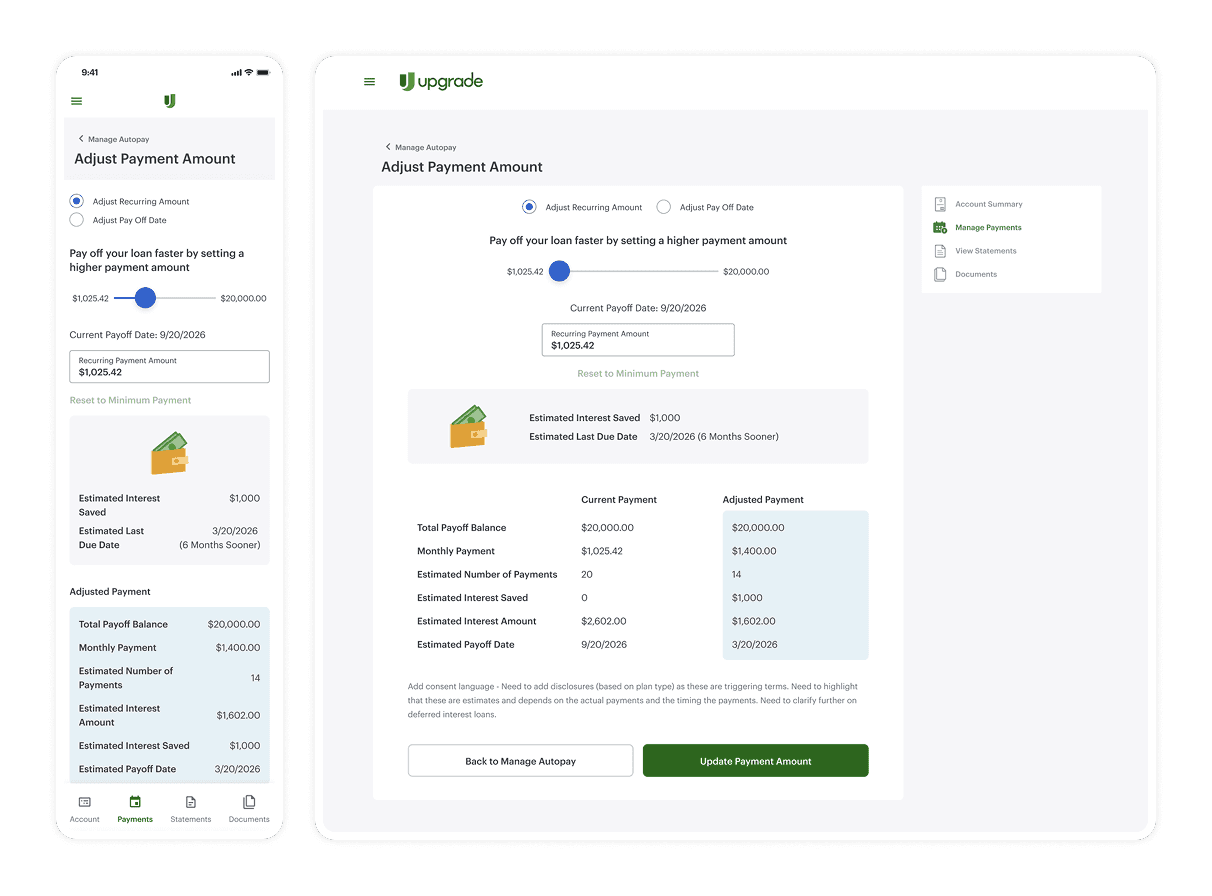
In the first iteration, I explored how borrowers might adjust their payment amounts while understanding tradeoffs in real time. The experience allowed users to modify payments through sliders or manual input, with immediate comparisons between current and adjusted payments to highlight savings and payoff impact.
Iteration 1
Through usability testing with 6 users via Userlytics, I found that while the experience surfaced helpful information, the amount of on-screen content and frequent updates made it hard for users to process information and commit to a decision. These insights led me to refocus the design on reducing cognitive load and supporting clearer, more confident decision-making.
Key changes include:
Introducing preset payment options to reduce decision fatigue
Separating selection from detailed comparison to create a clearer progression
Reframing savings and payoff benefits to be more scannable, reassuring, and action-oriented
Takeaway
Simplifying choices and introducing information step by step helped shift borrowers from exploration to confident action. By showing details only when they were relevant, the experience reduced cognitive load and made it easier for users to commit to larger monthly amounts.
Deliverables
Prototype focused on core flows and system behavior. Micro-interactions are simplified.

Accessibility & Discoverability
Multiple entry points within Manage Autopay surface the Savings Calculator at key moments in the flow, helping borrowers naturally discover it while managing payments.
Savings Calculator CTAs drove a 22% click-through rate after users visit Manage Autopay, demonstrating strong visibility and engagement.

User clicks on "Start Saving Now" or "Savings Calculator"
Clear & Guided Payment Options
3 preset payment options simplify decision-making, with a custom amount available for flexibility. Each option dynamically display projected interest savings and payoff timelines, helping borrowers understand the impact before committing.
~12% of borrowers engaged with the Savings Calculator and progressed through the repayment flow.

User selects their additional payment amount and click "Continue"
Comparison View
A side-by-side comparison of current vs. new monthly payments helps borrowers clearly see their savings and updated payoff timeline. This reinforces their decision and sets clear expectations before confirming the change.
In just 2 months, ~1,900 borrowers increased their payments by an average of $350 (130% increase).

User confirms their new payment amount and click "Update Payment Amount"
Takeaways
Results Summary
After launch, the Savings Calculator drove strong adoption and measurable repayment behavior change. Within two months, ~1,900 borrowers increased their monthly payments by an average of $350 (a 130% lift). Additionally, overall Autopay adoption also rose from 79% to 81% shortly after launch.

As a result, borrowers save on interest while the business sees measurable impact through increased repayment amounts, improved cash flow, and higher Autopay adoption.
Challenges
While the results were strong, delivering this experience required navigating several operational and compliance complexities.
High complexity of use cases: Home Improvement offers 20+ payment options, each with distinct calculation logic and legal disclaimers. This required designing for numerous edge cases and partnering closely with compliance to align on approved language for every loan type. To streamline future work, I created reusable disclosure templates that have since been adopted beyond this project.
Platform differences & engineering constraints: The mobile and desktop experiences were not 1:1, which extended projected development timelines. However, we needed to account for different viewports and interaction patterns across platforms, so I validated the approach with engineering through testing and cross-team feedback to ensure the solution could scale long term.
Next Steps
After seeing how successful the Autopay experience was, I’m now bringing the same savings-driven concept to one-time payments. This time around, we’re moving much faster by reusing the components, patterns, and compliance groundwork from the first launch.
It’s still in progress, but it’s been exciting to see how much smoother the process feels now that we’ve validated what works and built a stronger foundation to iterate on.